Smashburger
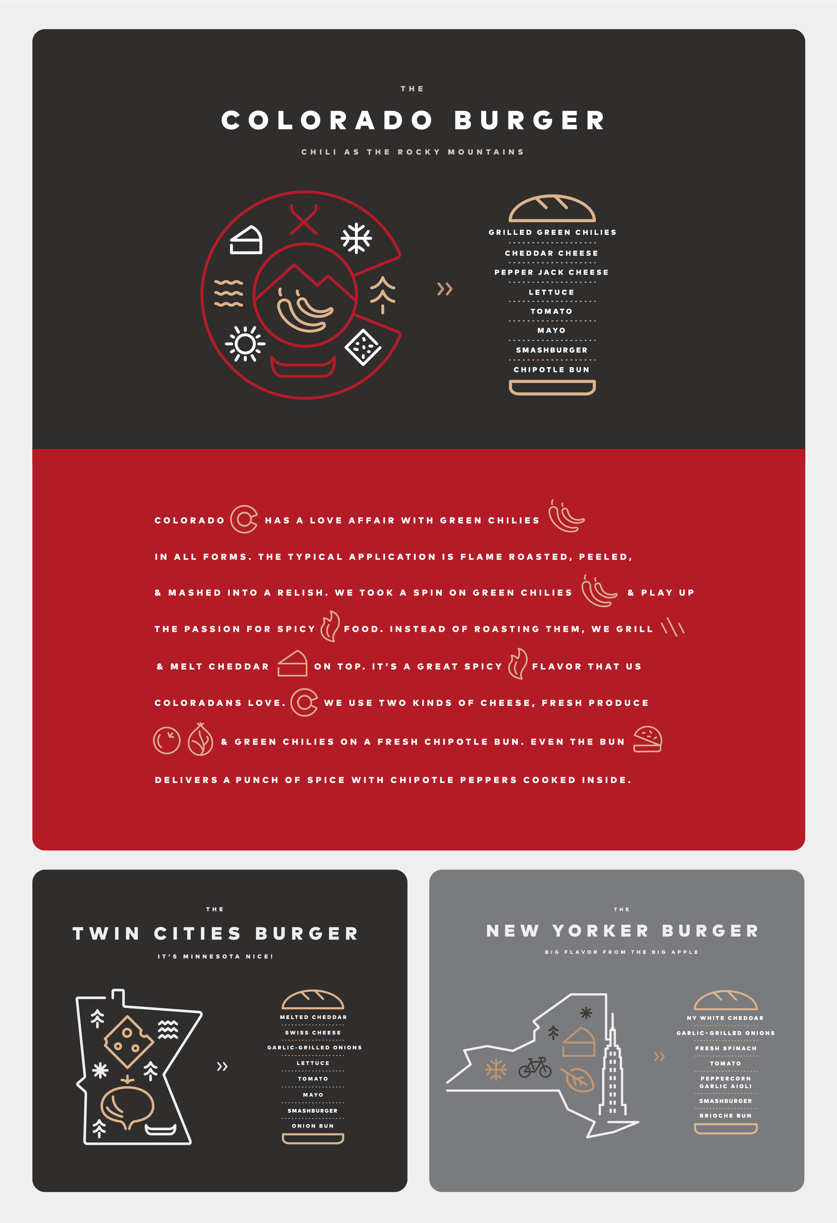
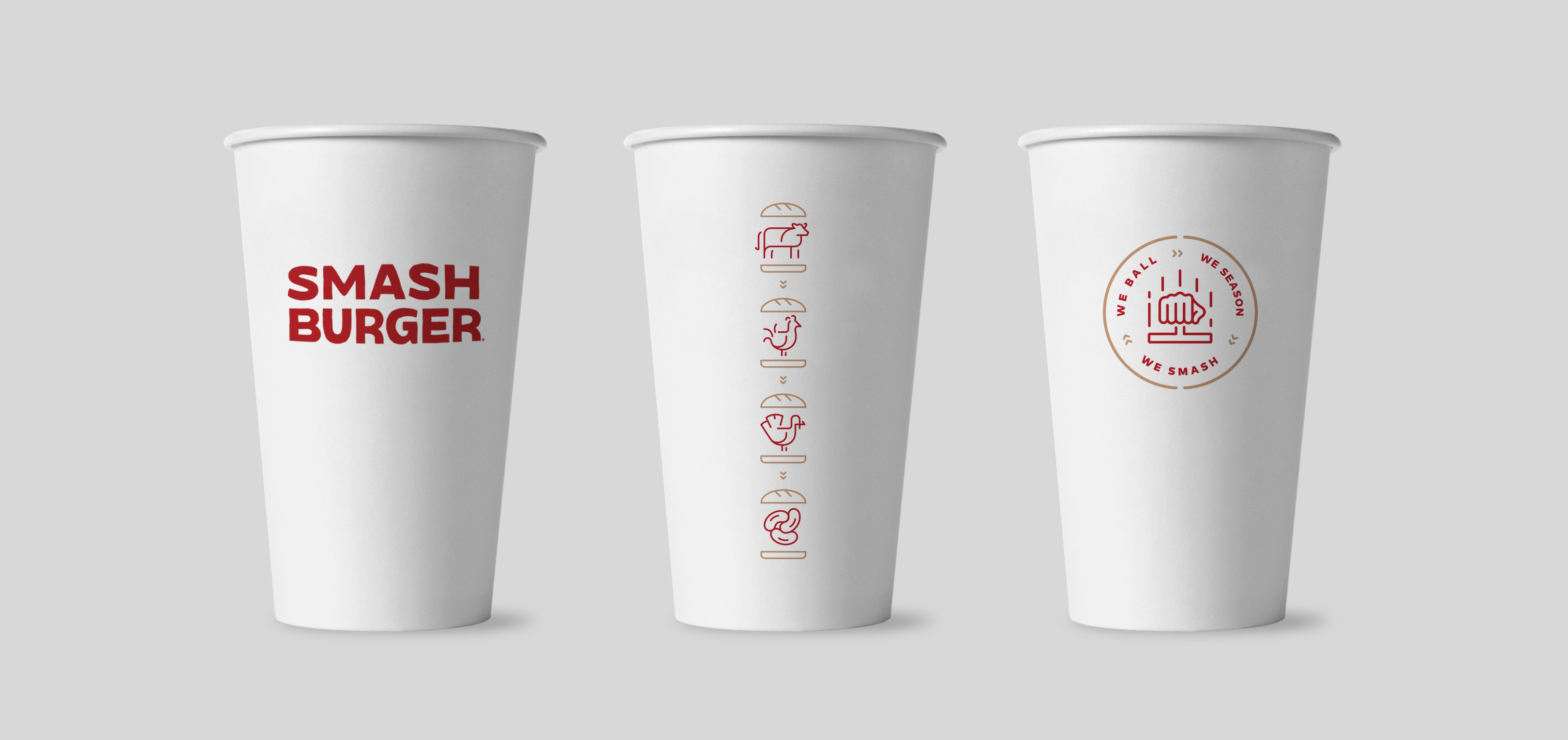
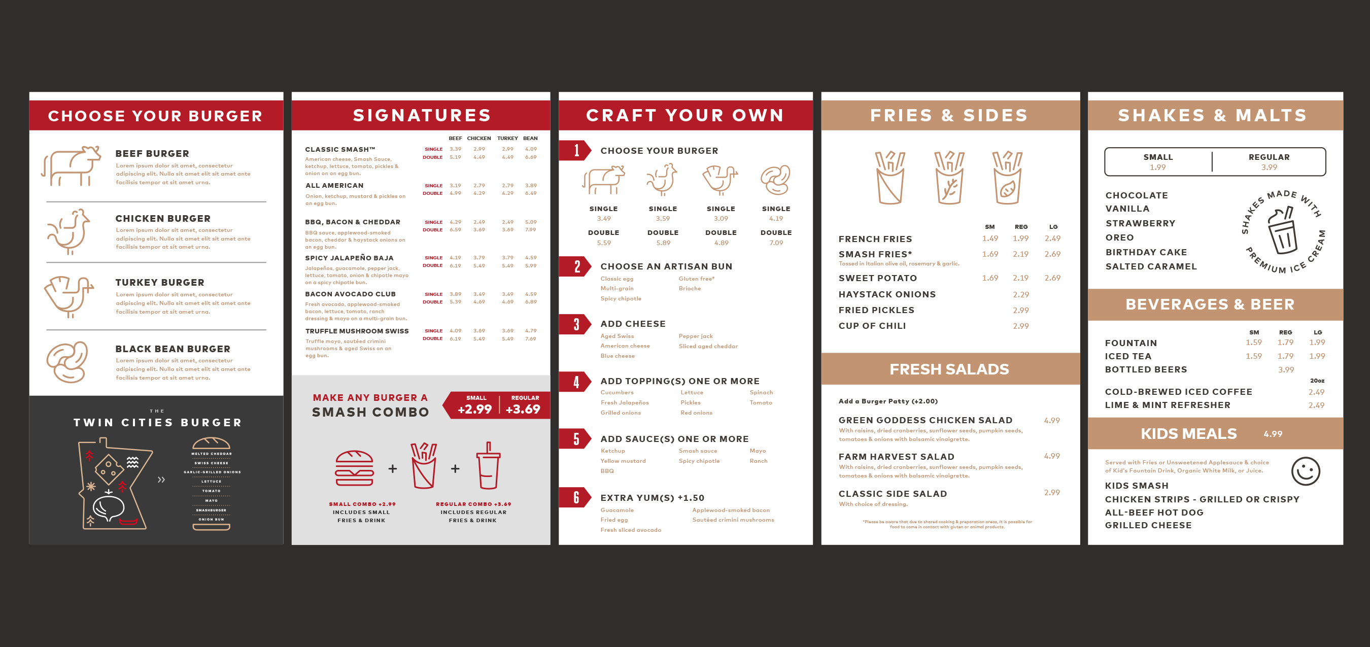
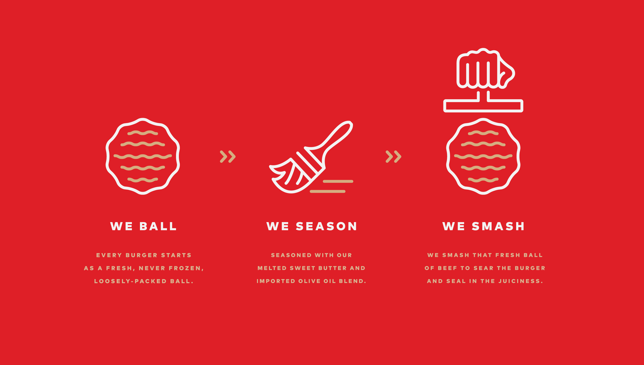
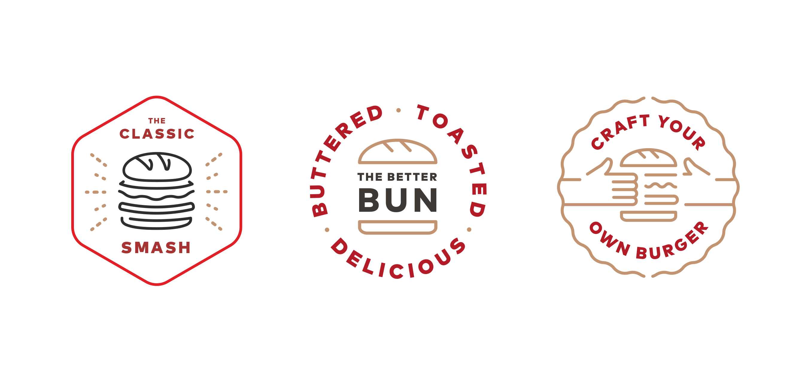
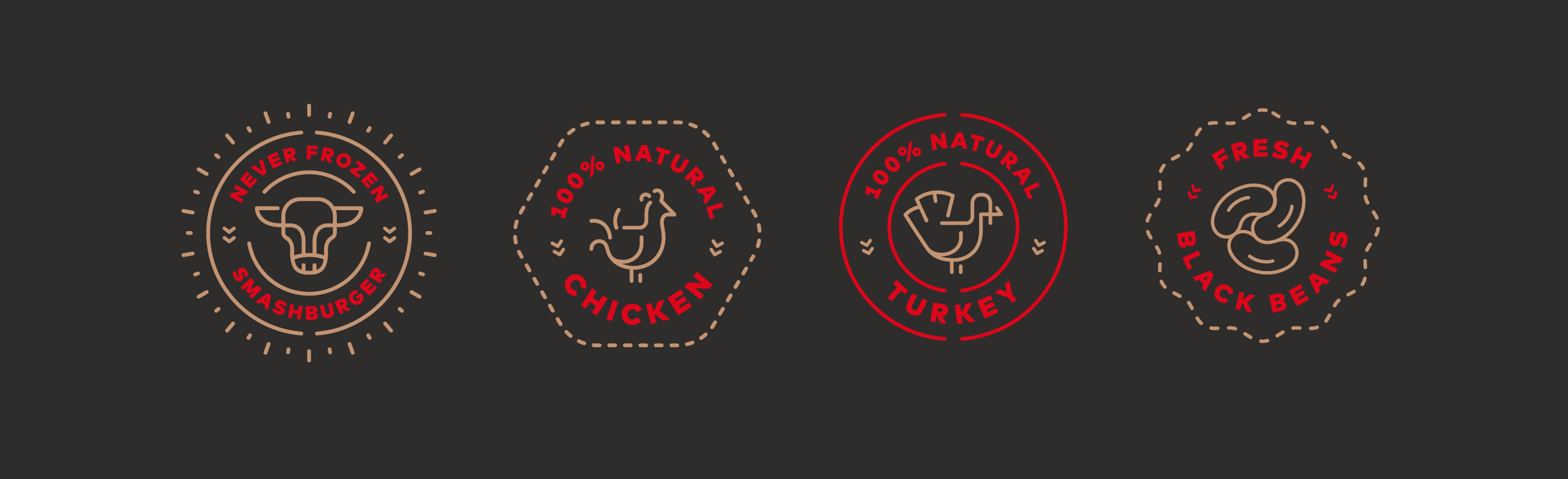
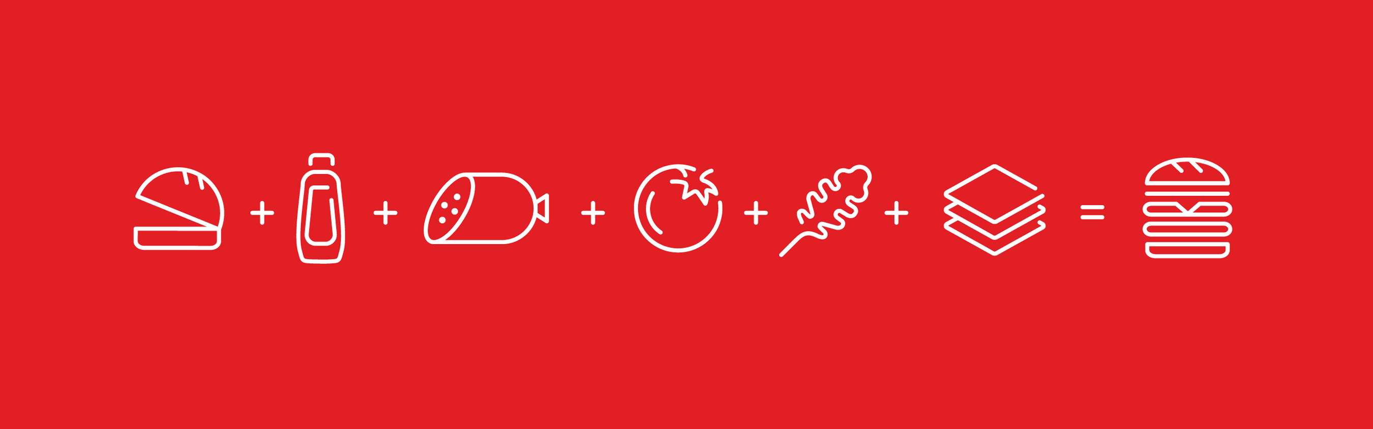
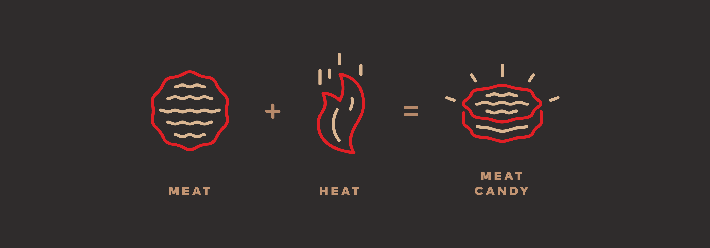
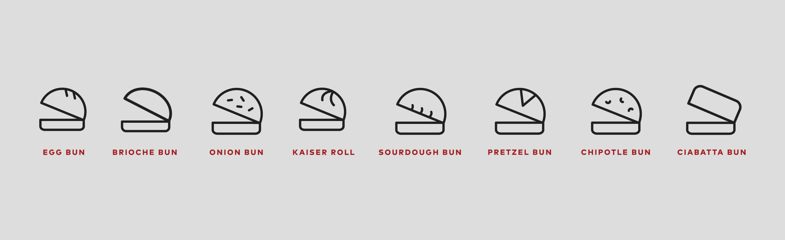
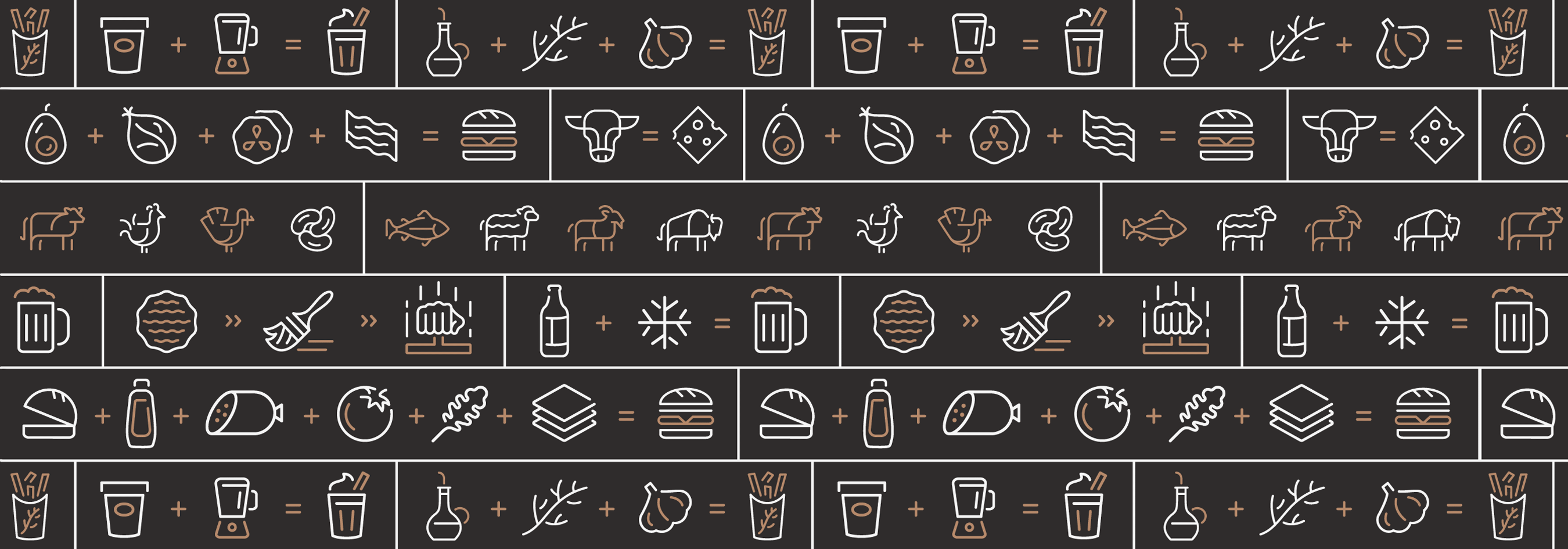
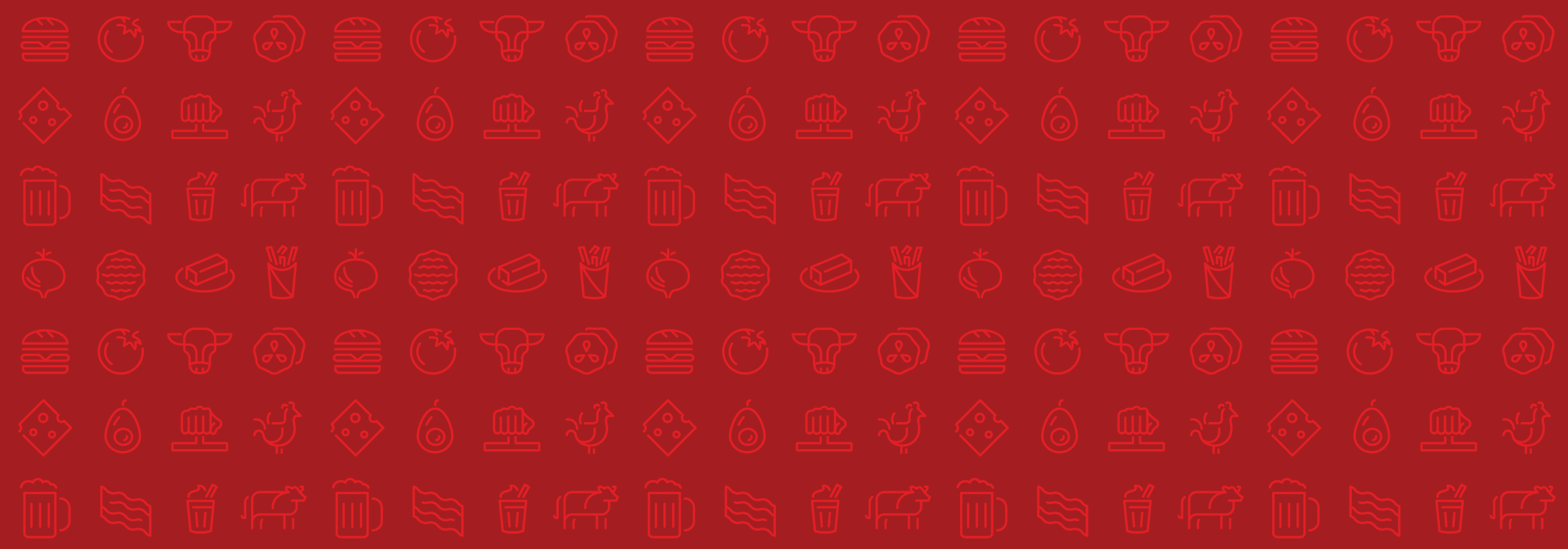
Smashburger was using a variety of logos in their system, so we were tasked with creating one mark to represent the brand. The system uses modern iconography, illustration, and typography to tie it all together visually. The modern line illustration icon system is inspired by American neon signage, western metal bending, cattle branding, and ancient visual languages such as hieroglyphs. The icons were also designed in a style that conveys dynamic motion and movement. The visual system captures the lore behind the brand, including the culinary traditions and techniques from around the world and the thoughtful curation of high quality and great tasting ingredients We also wanted to emphasize Regional Burgers, which are special recipes designed to represent the flavor profiles of specific geographic regions that Smashburger is located in.